文本(Text)
本部分转自
CSDN - onlyloveyd - Flutter Widgets: Text
本站个人笔记本使用,还请大家移步关注原作者。
此处只作备份,以防止作者删除。
Flutter 提供了 Text Widget 作为文本组件,用于现实简单的文本样式。
看它的源码:
  const Text(
    this.data, {//data就是我们需要展示的文字,这个是必传字段,其他的都是可选
    Key key,
    this.style,    //文本样式,类型是TextStyle,可以是 null
    this.strutStyle,    //解释看这里 https://www.ojit.com/article/270075
    this.textAlign,    //文本的对齐方式;可以选择左对齐、右对齐还是居中,类型是TextAlign
    this.textDirection,    //文字的方向,类型是TextDirection
    this.locale,    //区域设置,国际化用到
    this.softWrap,    //是否自动换行,若为false,文字将不考虑容器大小,单行显示,超出屏幕部分将默认截断处理
    this.overflow,    //文本的截断方式,和 maxLines 搭配使用,类型是TextOverflow
    this.textScaleFactor,    //代表文本相对于当前字体大小的缩放因子,相对于去设置文本的样式style属性的fontSize,它是调整字体大小的一个快捷方式。double类型,默认为1.0
    this.maxLines,    //指定文本显示的最大行数,默认情况下,文本是自动折行的,如果指定此参数,则文本最多不会超过指定的行。int 类型
    this.semanticsLabel,    //String 类型,给文本加上一个语义标签,没有实际用处
    this.textWidthBasis,    //一行或多行文本宽度的不同方式,类型是TextWidthBasis
  })
文本风格(TextStyle)
Text 只是简单的提供了文本的一些对齐、换行操作,颜色、大小、字体等等统统由 TextStyle 来提供。
看它的源码:
  const TextStyle({
    this.inherit = true,    //是否继承父Text的样式,默认为true
    this.color,    //文字的颜色 类型为Color
    this.backgroundColor,    //背景颜色 类型为Color
    this.fontSize,    //double 类型,文字的大小
    this.fontWeight,    //字体粗细,类型是FontWeight
    this.fontStyle,    //是否在字体中倾斜字形,类型为FontStyle
    this.letterSpacing,    // double类型,字母之间的间隔 (负值可以让字母更紧凑)
    this.wordSpacing,    //double类型,单词之间的间隔(负值可以让单词更紧凑)
    this.textBaseline,    //用于对齐文本的水平线,类型是 TextBaseline
    this.height,    //double类型,文本的高度,但它并不是一个绝对值,而是一个因子,具体的行高等于fontSize*height。
    this.locale,    //选择用户语言和格式的标识符,类型是Locale
    this.foreground,    //文本的前景色,类型是Paint
    this.background,    //文本的背景色    ,类型是Paint
    this.shadows,    //在文本下方绘制阴影,类型是List< ui.Shadow>
    this.fontFeatures,    //字体选择字形的列表,类型List<ui.FontFeature>
    this.decoration,    //文本的线条,类型是TextDecoration
    this.decorationColor,    //TextDecoration 线条的颜色,类型是Color
    this.decorationStyle,    //TextDecoration 线条的样式,类型是TextDecorationStyle
    this.decorationThickness,    //double类型,默认为1.0,表示使用字体的基本画笔厚度宽度
    this.debugLabel,    //String 类型,文本样式的描述无实际用处
    String fontFamily,    //String类型,用于设置使用哪种自定义字体
    List<String> fontFamilyFallback,    //String 类型,字体列表,当前面的字体找不到时,会在这个列表里依次查找
    String package,    //String 类型,用于设置使用哪种自定义字体
  })
案例尝试
textAlign - 文本对齐方式
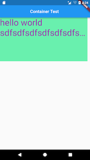
body: new Container(
    width: 400.0,
    height: 200.0,
    color: Colors.greenAccent,
    child: new Text("hello world sdfdfgdfgdfgdfgdfgdfgdfgdfgdfgdfgdfg",
        textAlign: TextAlign.right,
        style: new TextStyle(
          color: Colors.purple,
          fontSize: 40.0,
        )
    )
)
TextAlign.left
效果:
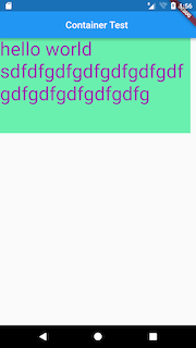
TextAlign.right
效果:

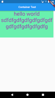
TextAlign.center
效果:
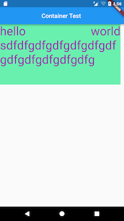
TextAlign.justify(两端对齐)
效果:
TextAlign.start
效果:

TextAlign.end
效果:

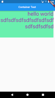
textDirection - 文本方向
body: new Container(
    width: 400.0,
    height: 200.0,
    color: Colors.greenAccent,
    child: new Text("hello world sdfsdfsdfsdfsdfsdfsdfsdfsdfsdfsd",
        textDirection: TextDirection.rtl,
        style: new TextStyle(
          color: Colors.purple,
          fontSize: 40.0,
        )
    )
)
TextDirection.ltr
效果:

TextDirection.rtl
效果:
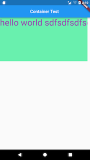
softWrap - 是否自动换行,若为false,文字将不考虑容器大小,单行显示,超出屏幕部分将默认截断处理
body: new Container(
    width: 400.0,
    height: 200.0,
    color: Colors.greenAccent,
    child: new Text("hello world sdfsdfsdfsdfsdfsdfsdfsdfsdfsdfsd",
        softWrap: false,
        style: new TextStyle(
          color: Colors.purple,
          fontSize: 40.0,
        )
    )
)
softWrap = true
效果:
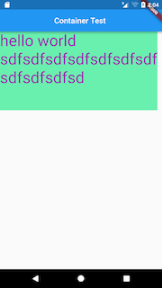
softWrap = false
效果:
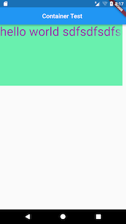
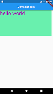
overflow - 当文字超出屏幕的时候,如何处理
body: new Container(
    width: 300.0,
    height: 200.0,
    color: Colors.greenAccent,
    child: new Text("hello world sdfsdfsdfsdfsdfsdfsdfsdfsdfsdfsd",
        overflow: TextOverflow.ellipsis,
        softWrap: false,
        style: new TextStyle(
          color: Colors.purple,
          fontSize: 40.0,
        )
    )
)
TextOverflow.clip(裁剪)
效果:

TextOverflow.fade(渐隐)
效果:
TextOverflow.ellipsis(省略号)
效果:
textScaleFactor
字体显示倍率,上面的例子使用的字体大小是40.0,将字体设置成20.0,然后倍率为2,依然可以实现相同的效果
body: new Container(
    width: 400.0,
    height: 200.0,
    color: Colors.greenAccent,
    child: new Text("hello world sdfsdfsdfsdfsdfsdfsdfsdfsdfsdfsd",
        overflow: TextOverflow.fade,
        textScaleFactor: 2.0,
        softWrap: false,
        style: new TextStyle(
          color: Colors.purple,
          fontSize: 20.0,
        )
    )
)
maxLines
最大行数设置
body: new Container(
 width: 400.0,
 height: 200.0,
 color: Colors.greenAccent,
 child: new Text("hello world sdfsdfsdfsdfsdfsdfsdfsdfsdfsdfsd",
     maxLines: 2,
     overflow: TextOverflow.ellipsis,
     style: new TextStyle(
       color: Colors.purple,
       fontSize: 40.0,
     )
 )
)
效果:
data & textSpan
data,普通的String类型,无需赘述 textSpan,TextSpan类型,个人觉得TextSpan最大的用处在于处理多种类型和显示效果的文字,以及各自点击事件的处理,看下面这个例子。
class HomeBody extends StatelessWidget {
  @override
  Widget build(BuildContext context) {
    // TODO: implement build
    return new Container(
        width: 400.0,
        height: 200.0,
        color: Colors.greenAccent,
        child: new Text.rich(new TextSpan(
          text: "one",
          style: new TextStyle(
            fontSize: 40.0,
            color: Colors.green,
            decoration: TextDecoration.underline,
            decorationColor: Colors.purple,
            decorationStyle: TextDecorationStyle.wavy,
          ),
          children: [
            new TextSpan(
              text: "TWO",
              style: new TextStyle(
                fontSize: 40.0,
                color: Colors.green,
                decoration: TextDecoration.underline,
                decorationColor: Colors.purple,
                decorationStyle: TextDecorationStyle.wavy,
              ),
              recognizer: new TapGestureRecognizer()
                ..onTap = () =>
                    Scaffold.of(context).showSnackBar(new SnackBar(
                      content: new Text("TWO is tapped"),
                    )),),
            new TextSpan(
              text: "THREE",
              style: new TextStyle(
                fontSize: 40.0,
                color: Colors.black12,
                decoration: TextDecoration.overline,
                decorationColor: Colors.redAccent,
                decorationStyle: TextDecorationStyle.dashed,
              ), recognizer: new LongPressGestureRecognizer()
              ..onLongPress = () =>
                  Scaffold.of(context).showSnackBar(new SnackBar(
                    content: new Text("THREE is longpressed"),
                  )),),
            new TextSpan(
                text: "four",
                style: new TextStyle(
                  fontSize: 40.0,
                  color: Colors.green,
                  decoration: TextDecoration.lineThrough,
                  decorationColor: Colors.yellowAccent,
                  decorationStyle: TextDecorationStyle.dotted,
                ),
                recognizer: new TapGestureRecognizer()
                  ..onTap = () {
                    var alert = new AlertDialog(
                      title: new Text("Title"),
                      content: new Text("four is tapped"),
                    );
                    showDialog(context: context, child: alert);
                  }
            )
          ],
          recognizer: new TapGestureRecognizer()
            ..onTap = () =>
                Scaffold.of(context).showSnackBar(new SnackBar(
                  content: new Text("one is tapped"),
                )),
        ),)
    );
  }
}
4段文字,不完全相同的样式,不完全相同的事件处理。
效果:

自定义字体
导入字体文件
通常的做法是将字体文件放在 Flutter项目根目录的
fonts或assets文件夹中。例如,要将 Raleway 和Roboto Mono字体文件导入到项目中,文件夹结构可能如下所示:
你的 APP 目录/
  fonts/
    Raleway-Regular.ttf
    Raleway-Italic.ttf
    RobotoMono-Regular.ttf
    RobotoMono-Bold.ttf
在 pubspec 中声明字体
在字体文件导入之后,需要在
pubspec.yaml文件中声明它们,告诉 Flutter 在去什么地方找它们:flutter: fonts: - family: Raleway fonts: - asset: fonts/Raleway-Regular.ttf - asset: fonts/Raleway-Italic.ttf style: italic - family: RobotoMono fonts: - asset: fonts/RobotoMono-Regular.ttf - asset: fonts/RobotoMono-Bold.ttf weight: 700通过
family为字体设置一个名称,以便我们在 TextStyle 中使用它们;可以给字体设置粗细、倾斜等样式:weight属性指定字体的粗细,取值范围是100到900之间的整百数(100的倍数). 这些值对应FontWeight, 可以用于TextStyle的fontWeight属性。style指定字体是倾斜还是正常,对应的值为italic和normal. 这些值对应FontStyle可以用于TextStyle的 fontStyleTextStyle属性
将字体设置为默认字体
有两种方式使用字体,一种是设置默认字体,一种是在特定位置指定。
设置默认字体需要在应用界面的
theme中指定:theme: ThemeData( fontFamily: xxx ),在 Text 中使用字体
为 Text 设置字体需要使用 textStyle 属性:
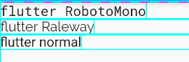
body: Column(
          //测试Row对齐方式,排除Column默认居中对齐的干扰
          children: <Widget>[
            Row(
              children: <Widget>[
                Text(
                  "flutter RobotoMono",
                  style: TextStyle(fontFamily: 'RobotoMono'),
                ),
              ],
            ),
            Row(
              children: <Widget>[
                Text(
                  "flutter Raleway",
                  textAlign: TextAlign.center,
                  style: TextStyle(fontFamily: 'Raleway'),
                ),
              ],
            ),
            Row(
              children: <Widget>[
                Text(
                  "flutter normal",
                ),
              ],
            ),
          ],
        ));
效果如下:
文本输入框(TextField)
本部分转自:Realank - 简书 - Flutter TextField详解
本站个人笔记本使用,还请大家移步关注原作者。
此处只作备份,以防止作者删除。
和 Android 中的 EditText 效果一样,Flutter 提供了 TextField ,先看源码:
const TextField({
    Key key,
    this.controller,//控制TextField的编辑,不设置会有默认值,类型是TextEditingController
    this.focusNode,//用于控制TextField是否有当前键盘的输入焦点,类型是FocusNode
    this.decoration = const InputDecoration(),//用于控制TextField的外观显示,如颜色,边框等,类型是InputDecoration
    TextInputType keyboardType,//用于设置该输入框默认的键盘输入类型,类型是TextInputType
    this.textInputAction,//键盘动作按钮图标(即回车键位图标),类型是TextInputAction
    this.textCapitalization = TextCapitalization.none,//定义文本的大写格式,类型是TextCapitalization
    this.style,//文本样式,类型是TextStyle
    this.strutStyle,//使用的支柱风格,类型是StrutStyle
    this.textAlign = TextAlign.start,//文本的对齐方式,类型是TextAlign
    this.textAlignVertical,//垂直对齐,类型是TextAlignVertical
    this.textDirection,//文字方向,类型TextDirection
    this.readOnly = false,//bool类型,文本是不是不能编辑
    this.showCursor,//bool类型,是否显示光标
    this.autofocus = false,//类型是bool,是否自动获取焦点
    this.obscureText = false,//类型是bool,是否隐藏正在编辑的文本,用于密文等,文本内容会用“•”替换,默认为false
    this.autocorrect = true,//类型是bool,是否自动更正
    this.maxLines = 1,//类型是int,显示的最大行数
    this.minLines,//类型是int,最小展示行数
    this.expands = false,//bool 类型,是否可扩展
    this.maxLength,//类型是int,输入框中允许的最大字数
    /**
    *  类型是bool,是否强制限制最大字符数,默认为true
    *  true:强制限制最大字符数
    *  false:不限制最大字符数,即使设置了maxLength也不生效
    **/
    this.maxLengthEnforced = true,
    this.onChanged,//输入框内容改变时的回调函数,类型是ValueChanged
    this.onEditingComplete,//输入框输入完成时触发,但是onEditingComplete没有参数,不会返回内容,类型是VoidCallback
    this.onSubmitted,//输入框输入完成时触发,但是onSubmitted有参数,会返回内容,类型是ValueChanged
    this.inputFormatters,//用于指定输入格式;当用户输入内容改变时,会根据指定的格式来校验。类型是List< TextInputFormatter>
    /**
    *  类型是bool,输入框是否禁用,如果为false,则输入框会被禁用
    *    ,禁用状态不接收输入和事件,同时* *   显示禁用态样式(在其
    *   decoration中定义)。
    **/
    this.enabled,
    this.cursorWidth = 2.0,//类型是double,自定义输入框光标宽度
    this.cursorRadius,//自定义输入框光标圆角,类型是Radius
    this.cursorColor,//自定义光标颜色,类型是Color
    this.keyboardAppearance,//设置键盘的外观模式,只能在iOS上使用,类型是Brightness
    this.scrollPadding = const EdgeInsets.all(20.0),//文本框滑动时的间距,类型是EdgeInsets
    this.dragStartBehavior = DragStartBehavior.start,//设置设置决定了用户何时正式启动拖动,类型是DragStartBehavior
    this.enableInteractiveSelection,//类型是bool 是否启用交互式选择,true:长按将会选中文字,并且弹出 cut/copy/paste 的菜单
    this.onTap,//TextField的点击事件,类型是GestureTapCallback
    this.buildCounter,//生成自定义 InputDecorator.counter 小部件的回调,类型是InputCounterWidgetBuilder
    this.scrollController,//类型是ScrollController,滚动监听器
    this.scrollPhysics,//类型是 ScrollPhysics,确定滚动的物理属性
  })
案例尝试
最简单的就是无参数调用构造方法:
TextField()
光有输入框还不行,还得获取其中的内容,所以需要传递controller:
import 'package:flutter/material.dart';

class TextFieldPage extends StatelessWidget {
  Widget buildTextField(TextEditingController controller) {
    return TextField(
      controller: controller,
    );
  }

  @override
  Widget build(BuildContext context) {
    final controller = TextEditingController();
    controller.addListener(() {
      print('input ${controller.text}');
    });
    return Scaffold(
      appBar: AppBar(
        title: Text('TextField'),
      ),
      body: Padding(
        padding: const EdgeInsets.all(20.0),
        child: buildTextField(controller),
      ),
    );
  }
}
我通过给
controller添加通知来获取TextField的值,这种使用场景不一定合适,更多的时候是在点击按钮的时候直接读取controller.text的值。另外
TextFiled还有以下小的属性:import 'package:flutter/material.dart'; import 'package:flutter/services.dart'; class TextFieldPage extends StatelessWidget { Widget buildTextField(TextEditingController controller) { return TextField( controller: controller, maxLength: 30,//最大长度,设置此项会让TextField右下角有一个输入数量的统计字符串 maxLines: 1,//最大行数 autocorrect: true,//是否自动更正 autofocus: true,//是否自动对焦 obscureText: true,//是否是密码 textAlign: TextAlign.center,//文本对齐方式 style: TextStyle(fontSize: 30.0, color: Colors.blue),//输入文本的样式 inputFormatters: [WhitelistingTextInputFormatter.digitsOnly],//允许的输入格式 onChanged: (text) {//内容改变的回调 print('change $text'); }, onSubmitted: (text) {//内容提交(按回车)的回调 print('submit $text'); }, enabled: true,//是否禁用 ); } @override Widget build(BuildContext context) { final controller = TextEditingController(); controller.addListener(() { print('input ${controller.text}'); }); return Scaffold( appBar: AppBar( title: Text('TextField'), ), body: Padding( padding: const EdgeInsets.all(20.0), child: buildTextField(controller), ), ); } }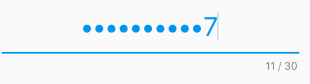
接着我还能显示
placeholderdecoration可以给TextField添加装饰TextField( decoration: InputDecoration(fillColor: Colors.blue.shade100, filled: true, labelText: 'Hello'), );fillColor设置填充颜色,labelText设置标签文字,这个标签在没有输入的时候是占满输入框的,当输入聚焦以后,就会缩小到输入框左上角: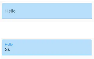
TextField( decoration: InputDecoration( fillColor: Colors.blue.shade100, filled: true, hintText: 'Hello', errorText: 'error'), );hintText就是普通的placeholder,输入后就不显示了,errorText是错误提示: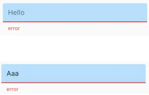
还能显示一些别的装饰
import 'package:flutter/material.dart';

class TextFieldPage extends StatelessWidget {
  Widget buildTextField() {
    return TextField(
      decoration: InputDecoration(
          fillColor: Colors.blue.shade100,
          filled: true,
          helperText: 'help',
          prefixIcon: Icon(Icons.local_airport),
          suffixText: 'airport'),
    );
  }

  @override
  Widget build(BuildContext context) {
    return Scaffold(
      appBar: AppBar(
        title: Text('TextField'),
      ),
      body: Padding(
        padding: const EdgeInsets.all(20.0),
        child: buildTextField(),
      ),
    );
  }
}
这些还不过瘾,我不喜欢这个安卓风格的下面的装饰线,我想变成圆角矩形的边框
import 'package:flutter/material.dart';

class TextFieldPage extends StatelessWidget {
  Widget buildTextField() {
    return TextField(
      decoration: InputDecoration(
          contentPadding: EdgeInsets.all(10.0),
          border: OutlineInputBorder(
            borderRadius: BorderRadius.circular(15.0),
//            borderSide: BorderSide(color: Colors.red, width: 3.0, style: BorderStyle.solid)//没什么卵效果
          )),
    );
  }

  @override
  Widget build(BuildContext context) {
    return Scaffold(
      appBar: AppBar(
        title: Text('TextField'),
      ),
      body: Container(
        color: Colors.blue.shade100,
        child: Padding(
          padding: const EdgeInsets.all(30.0),
          child: buildTextField(),
        ),
      ),
    );
  }
}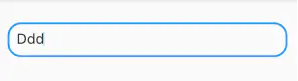
改变装饰线颜色
import 'package:flutter/material.dart';

class TextFieldPage extends StatelessWidget {
  Widget buildTextField() {
    return Theme(
      data: new ThemeData(primaryColor: Colors.red, hintColor: Colors.blue),
      child: TextField(
        decoration: InputDecoration(
            contentPadding: EdgeInsets.all(10.0),
            border: OutlineInputBorder(
              borderRadius: BorderRadius.circular(15.0),
//            borderSide: BorderSide(color: Colors.red, width: 3.0, style: BorderStyle.solid)//没什么卵效果
            )),
      ),
    );
  }

  @override
  Widget build(BuildContext context) {
    return Scaffold(
      appBar: AppBar(
        title: Text('TextField'),
      ),
      body: Padding(
        padding: const EdgeInsets.all(30.0),
        child: buildTextField(),
      ),
    );
  }
}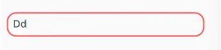
改变边框的粗细
这些
TextField的decoration彻底不能满足要求了,需要重构成这种方式:import 'package:flutter/material.dart'; class TextFieldPage extends StatelessWidget { Widget buildTextField() { return Container( padding: const EdgeInsets.all(8.0), alignment: Alignment.center, height: 60.0, decoration: new BoxDecoration( color: Colors.blueGrey, border: new Border.all(color: Colors.black54, width: 4.0), borderRadius: new BorderRadius.circular(12.0)), child: new TextFormField( decoration: InputDecoration.collapsed(hintText: 'hello'), ), ); } @override Widget build(BuildContext context) { return Scaffold( appBar: AppBar( title: Text('TextField'), ), body: Padding( padding: const EdgeInsets.all(30.0), child: buildTextField(), ), ); } }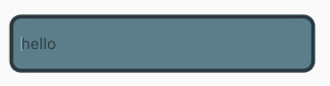
InputDecoration.collapsed可以禁用装饰线,而是使用外面包围的Container的装饰线。监听用户输入
当用户输入,
TextField的内容发生变化,TextField就会回调它的onChanged回调。因此onChanged可以实时查看TextField的内容变化onChanged: (String data){ //实时获取 print(data); },设置键盘类型
- TextInputType.text 文本输入键盘
- TextInputType.multiline 多行文本,需和
maxLines配合使用(设为null或大于1) T - TextInputType.number 数字;会弹出数字键盘
- TextInputType.phone 优化后的电话号码输入键盘;会弹出数字键盘并显示
* # - TextInputType.datetime 优化后的日期输入键盘;Android 上会显示
: - - TextInputType.emailAddress 优化后的电子邮件地址;会显示
@ . - TextInputType.url 优化后的
url输入键盘; 会显示/ .